Vega Updates - Sticker Sheets, Accessibility, Icons
announcement
Mar 29, 2022
Sticker Sheet
Designers have expressed to us that they need a simple place to be able to access design components that are consistent with the look and feel of Vega. While development teams are able to work with corresponding web components, designers need the raw tools for being able to create clean designs that are compliant with the Vega guidelines.
We are in the process of creating a sticker sheet of components that are designed to meet the demands of a current project.
This sticker sheet is a file within Figma which will enable designers to choose pre-constructed components for working within their designs. Each file has multiple variants for different purposes and states of a component, and includes some basic instructions for the best use of these components.
Below is a listing from the sticker sheet of the various different components that have been constructed in Figma as of this time:
- Accordion
- Badge
- Card
- Checkbox
- Date Picker
- Dropdown
- Input
- Modal
- Progress Tracker
- Radio
- Sidebar
- Stepper
These components will eventually be constructed into full web components and made available within Storybook.
Plugin Update
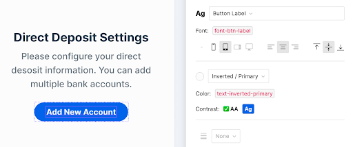
A new accessibility feature has been added to the Vega plugin. When selecting a text layer in Figma, you now have the ability to immediately see whether the text provides significant enough contrast against the background for passing WCAG AA requirements.
This feature appears just below the color token.
We have been using this new feature ourselves and have identified a number of places in some of our components where we do not pass the AA requirements. As a result, these components will soon be updated.
Once these changes are made, if you are using Vega component instances in your mockups, you will be able to update them when the changes come through and the modifications will be applied automatically to your designs.
Learn more about how to implement the Vega Plugin within Figma.
Icons
We are also currently working on adapting an icon set to be able to be integrated. Due to requests of design teams, we are transitioning away from the use of FontAwesome, and are now moving to a new icon set: Streamline
Please stay tuned for these new icon collections, and as we build an icon component.