Button
Examples
Primary variant
<vega-button
  id="checkout_btn"
  variant="primary"
>
  Checkout
</vega-button>Primary variant with icon
<vega-button
  id="checkout_btn"
  variant="primary"
  icon-align="left"
  icon="announcement"
>
  Checkout
</vega-button>Secondary Variant
<vega-button
  id="checkout_btn"
  variant="secondary"
>
  Cancel
</vega-button>Small Button
<vega-button
  id="checkout_btn"
  variant="primary"
  size="small"
>
  Checkout
</vega-button>Large Button
<vega-button
  id="checkout_btn"
  variant="primary"
  size="large"
>
  Checkout
</vega-button>Usage
Buttons may be used for a range of purposes. This can include communication of a series of actions that users can take in multiple places. They are specifically used for taking action on a page. These can include being used to add items, close windows, cancel actions, or saving content.
Below are some examples of places where buttons are used:
Forms
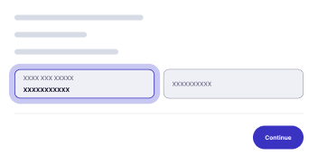
Buttons are used for submission, saving, or canceling of actions.
Modal Windows
Buttons may appear as acknowledgement of confirmation, or to cancel an action.
Toolbars

If there are a series of actions which can be performed, such as for a multimedia device, buttons may be used.
Cards
Calls to action may appear in cards.
Types of Buttons
Buttons can appear and be used in the following ways:
- Text buttons
- Link Lists
- CTAs
- Form Controls
- Media Controls
- Notifications and Messaging Triggers
Button States
Buttons in Vega have the following states:
- Default
- Hovered
- Focused
- Pressed
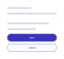
Variants
There are two variants for buttons in Vega:
- Primary
- Secondary
Primary buttons should be used for the main or preferred action on a page, such as for form submissions. Secondary buttons should be used for secondary actions, such as “cancel.”
Properties
| Name | Description | Default |
|---|---|---|
| type | The type of Vega button. If you wish to directly submit a form, set the type as submit. button, submit, reset |
button |
| variant | The component itself contains two variants: primary and secondary. The primary variant should be used for buttons which are the main selection option for a form (or CTA), while the secondary should be the used for alternate options. | primary |
| size | Buttons have three sizes: default, small, and large, and should be chosen to fit the context of the specific form. | default |
| icon | The vega-button can optionally be associated with an icon, which may be chosen from a list of icon design tokens or by using a Font Aweseome class. string | |
| icon-align | Icon placement - left or right. | left |
| label | This designates the text which will be displayed on the button. string | |
| disabled | This will render the button to be grayed out and will appear to be disabled. Note: it is not recommended to use this attribute, as it may render the button to be non-ADA compliant. boolean | false |
| danger | Danger buttons should be used for destructive actions or actions that could cause unwanted results. boolean | false |
| block | If block is set to true, the button will span the full width of a parent. boolean |
false |
All parameters
<vega-button
    variant='primary|secondary'
    size='default|small|large'
    icon='e.g. cart'
    icon-align='left|right'
    label='Label'
    disabled=true|false
    danger=true|false
    block=true|false
>
    Label
</vega-button>
Setting Labels
There are two ways of setting the label on a button.
- Using the
labelattribute:
<vega-button id="checkout_btn" variant="primary" iconAlign="right" icon="cart" label="Checkout">
</vega-button>- Setting text inside the
vega-buttonelement:
<vega-button id="checkout_btn" variant="primary" iconAlign="right" icon="cart">
        Checkout
    </vega-button>
Note: If both the label and the text inside the element are set, the
labelattribute takes precendence. If you wish to dynamically change the label ofvega-buttonyou must use thelabelattribute.
Event
When a vega-button is clicked, the vegaClick event is dispatched.
document.getElementById("button_id").addEventListener("vegaClick", (e) => { console.log(e) })For more details, view in Storybook.
Accessibility
- Typography: Minimum font size should be set at 16 pixels.
- Buttons have discernible text.
- Keyboard support for buttons should be included.
- Color contrast between background and foreground meet WCAG AA requirements.
- Nested interactive controls are not announced by screen readers.
Best Practices
Buttons should be immediately identifiable on a page, and users should be able to gain an innate understanding of their purpose by their overall look and design.
They should be findable on a page, and should be easily distinguishable from other elements, including other buttons. Their purpose should be clear.
Placement
Buttons should be placed where they make the most sense on the page. This will vary between different button types and purposes. Some elements, such as floating action buttons, are placed for high visibility. For other types, they fit within the flow of the page; typically at the point where an action is to be performed, such as a submit button at the end of a form.
Do

Don't

Labeling
Buttons should have clear labels indicating what they do. For instance, instead of using the default “Submit” text, it has been determined to be far more useful for users if the button is labeled with the exact action that is being accomplished, such as “Submit Application” or “Send Email.
Do

Don't

Icon placement
We provide the option to place icons on buttons on either the left or the right side of a button. For LTR languages, current research suggests that it is best to place the icon on the left side, to make scanning easier for users. For RTL languages, the placement should be the reverse.
Do
Don't
Disabled Buttons
The use of the “disabled” state is discouraged due to various usability and accessibility issues, and should only be used if the need is clearly demonstrable and not substitutable with other options.
Button Links
Buttons should typically perform actions which are separate from normal links. If a button is to be used simply as a link between two pages, it is best to use a text link.