Creating Tables Using the Vega Plugin
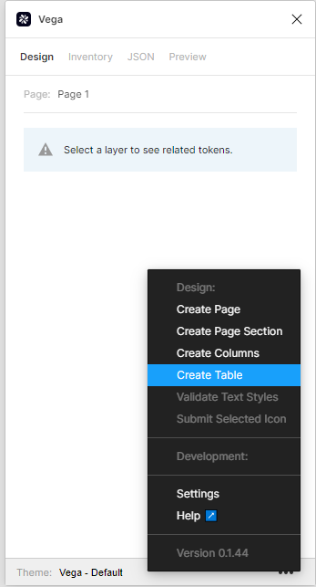
You can use the Vega Plugin to create table components. To do so, in the plugin, on the lower right, click on the three horizontal dots, and select Create Table.
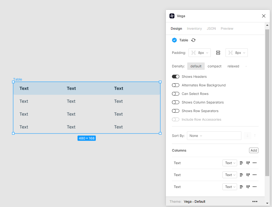
This will automatically generate a basic table as an auto layout frame on your screen. If you select the main table group using Command-click (Ctrl-Click on Windows), you can view settings in the plugin.
You may add more rows to your table by selecting a row, and clicking on Command-D (Ctrl-D on Windows).
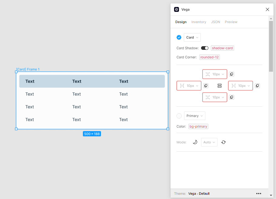
To place your table inside a card component, select it and then click Shift-A which will put it inside a frame, and you can select Card from the auto-layout dropdown:
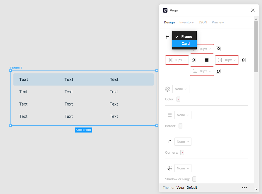
This will apply all settings for a card, including, corner radius, padding, shadows, etc.
By default the table is set as fixed width, however by setting it as fill container within a fixed width card, it can become flexible to meet the parameters of the card.
To do this, first select the card, and set it to Fixed Width using the Figma controls on the right.
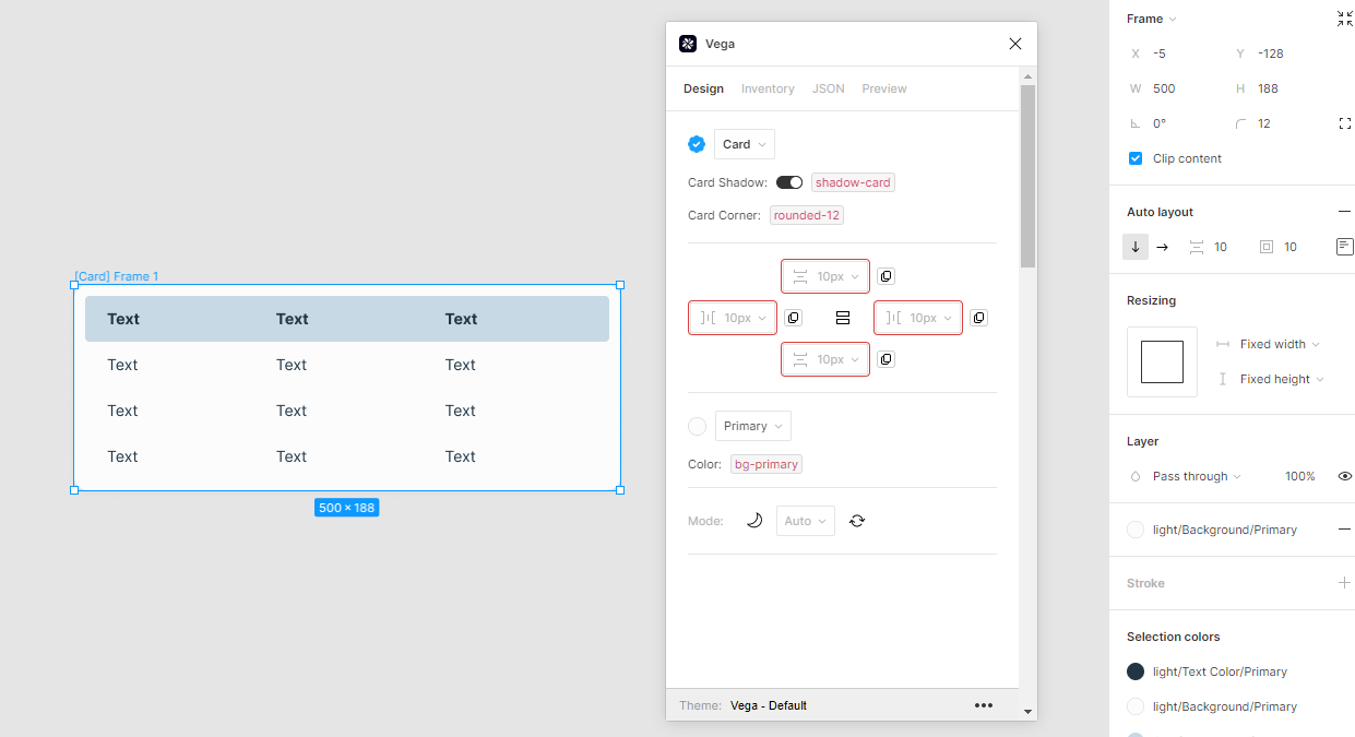
Next, select the table, and set it as Fill Container.
This way the table will scale to fit the card.
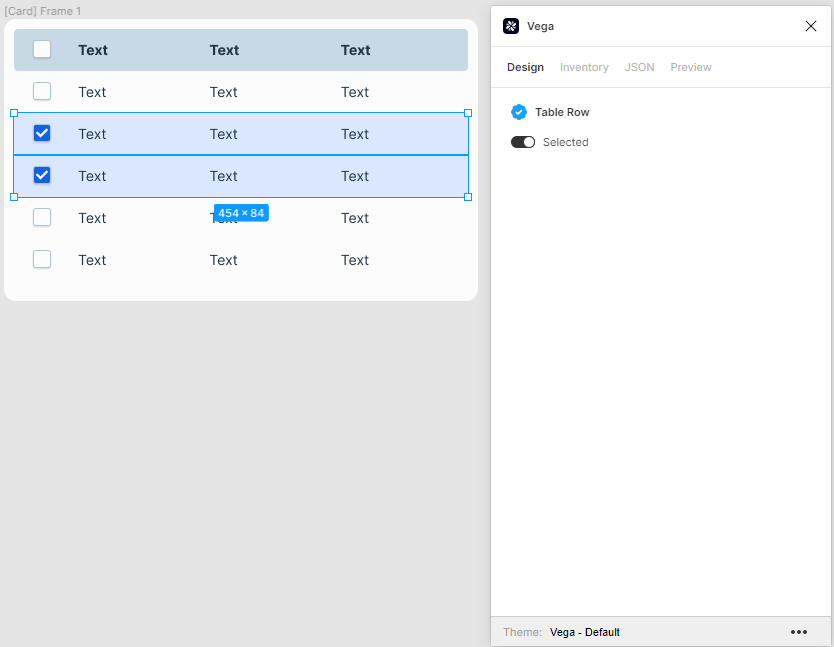
Selecting Rows
To select individual rows to manage them, select the table, and toggle the switch labeled Can Select Rows.
This will place a checkbox entry next to each row:
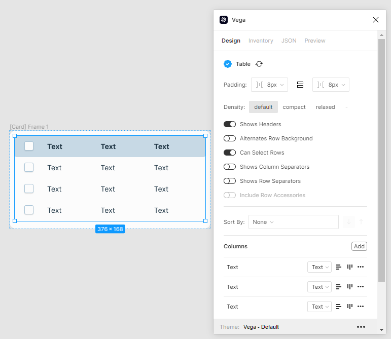
You can then select an individual row or rows in the table by focusing on the row, and then toggling the switch that appears to Selected: This will show each of the rows as selected and will change the background color.
This will automatically apply the correct color tokens to each of the tiles without having to do anything manually.
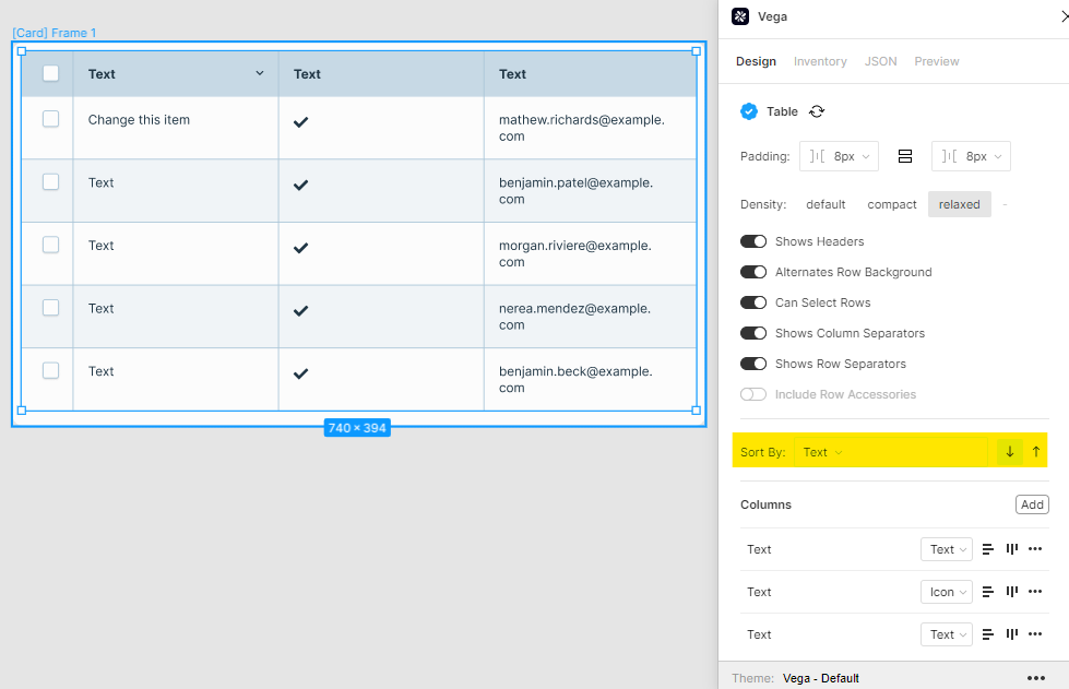
Table Styling
To add padding to the left and right side of the table, select the table and change the styles within the plugin.
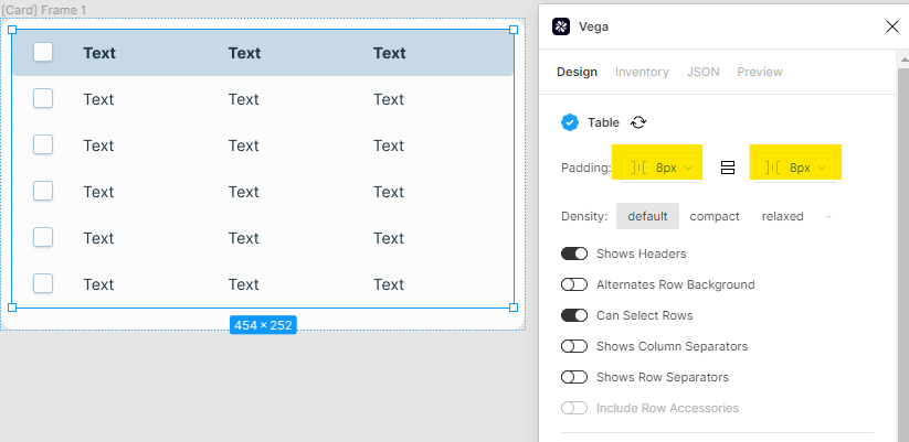
If you wish to manage the vertical styles, select the header and make the changes there.
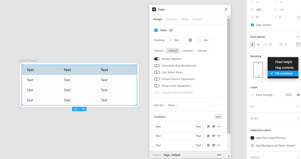
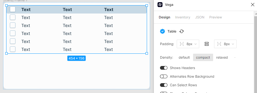
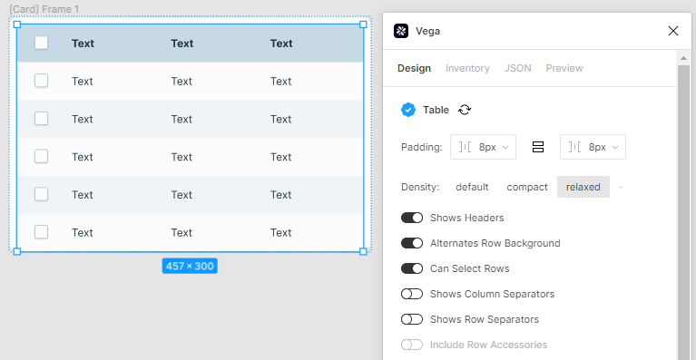
You can change the density of the padding within the cells by choosing the Density tabs. The default padding is 8px, but you can change it to Compact, which reduces padding:
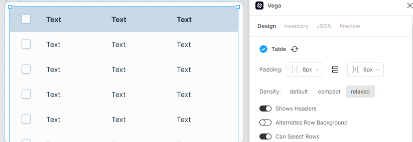
Alternately you may change it to Relaxed, which adds padding. Note, if it expands the table outside the card, you can resize the card to fit the table.
If you wish to use alternating colors for each row, choose the toggle labeled Alternates Row Background.
You may also add row and/or column separators using the respective toggle switches:
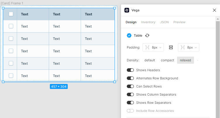
*Note: if using row and column separators, this will turn off the corner radius for the table*.
Note: if you add rows or columns to the table after setting these, it may not be properly synced. This can be remedied by clicking on the “refresh” icon next to Table.

Managing Columns
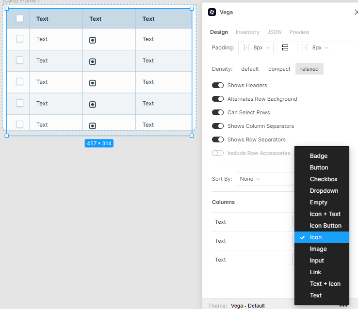
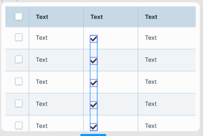
You can manage data types for columns in the table, in the Columns section of the plugin. To change the type of one of the rows to, for example, icons, choose the dropdown next to the column name, and choose Icon from the list. This will change all content within that column to a placeholder icon.
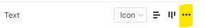
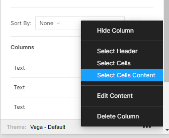
Then, to change the icon itself to something else, click on the three dots to the right of the column in the plugin:
And choose Select Cells Content
Click on the Glyph

And choose your preferred icon.
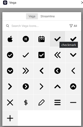
This will automatically update all the cells in the column on the table.
From the same location (the three dots to the right), you have several other options, such as
- Hide column
- Select Header
- Select Cells
- Edit Content
- Delete Column
You may also align the column to be left, center or right. The default position is top-aligned.
Editing content
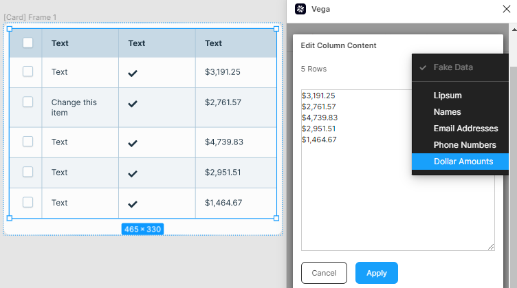
If you click on Edit Content as described above, you will see all the content of the cells in raw text format, where you may edit each row without having to click into each cell.
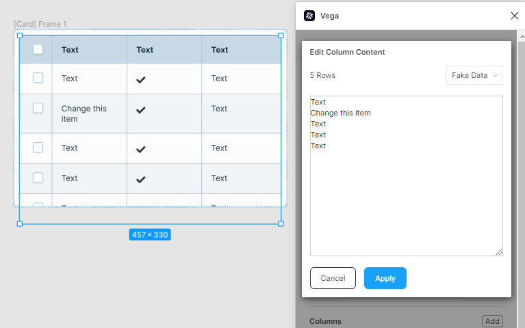
You may also enter fake data, including Lipsum, names, email addresses, phone numbers, and dollar amounts, by clicking on the Fake Data dropdown on the upper right.
Sorting
You also have the option of sorting content within the tables. This will work on alphabetical or numerical data.
To do so, click Sort and choose the column by which you wish to sort.
Adding Columns
To add a new column to your table, click on the Add button just to the right of the column listing: