Using Vega Figma Plugin - Developers
Once you have installed the Vega plugin for Figma, as is demonstrated in the getting started guide, this guide should help you understand the basics for working directly with the plugin.
The Vega plugin will ensure that you are able to create designs that are consistent with the Vega design system. It will ensure that you are correctly using acceptable tokens for colors, typography, shadows, and spacing in your designs. This will also help developers integrate your tokens into their codebase.
The Vega plugin, and by extension the Vega Design System will help you codify some of the most basic design decisions, and enable you to flex your creative abilities without having to be concerned with many of these mundane details, and to be able to effectively meet the needs of our end-users.
Colors
Vega is designed by default to be able to work in both light and dark modes. A single token will point to different base colors depending on which mode the user has selected. As a result, colors in Vega are chosen by their functional purposes, and not by actual color values; this is handled for you. This will provide you with the freedom of being able to choose a color without having to worry about whether it will work in a different mode; this is baked-in.
There are four types of color tokens in the Vega Design System
- Background or Fill Colors
- Text Colors
- Border Colors
- Shadow or Ring Colors
Background or Fill Colors
Colors that are specifically designated as background colors are meant to be applied specifically as backgrounds. They can be applied as the background of a page, or as the fill color for a specific element, such as a button.
Background color tokens are named based on how they are intended to be used. You will find four levels of general background colors (Primary, Secondary, Tertiary, and Quaternary) which are meant to be applied to different containers on a page to create a layered effect.
While page background tokens are typically used for the background of pages or screens, if necessary it is permissible to use a primary or secondary color as a background if it better fits the design.
All tokens contain a set of inverted colors.which can be used for areas of a page that need highlighting. For example, you may want a dark sidebar on a page with a light background. In this case you could use the inverted primary background color for the sidebar.
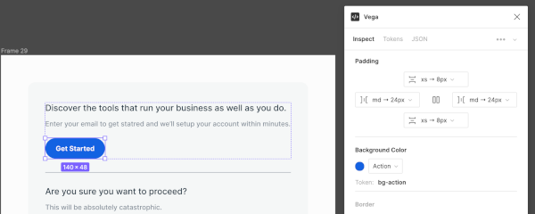
How to apply a background color to a label using the Vega plugin
- Launch the Vega plugin
- Open and select the Inspect tab
- Choose an appropriate color from the Background Color dropdown menu.
Actions
The Vega color tokens include a set of functional tokens that can be used for different types of actions.
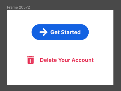
- The Action color is used for Buttons, and indicates to users that an action will be performed when they click or tap the respective component.
- The Danger color is used for Buttons that will perform a destructive action and require the user to proceed with caution.
Accent Colors
The system includes a set of 10 Accent Colors. These colors are meant to be used for styling elements that aren’t quite functional or semantic. For example, you might use Accent colors to style infographics and charts.
Accent colors can also be used for fills for glyphs or icons. For example, you might wish to use a primary color to fill an icon inside a button component.

Text Colors
You may apply color to text in Figma, by selecting a text layer. Like background colors, Text color tokens are organized into primary, secondary, tertiary, and quaternary levels. Choose a color token based on the level of your content within the page hierarchy.
Text colors also include functional variants:
- The Action color is used for Links, and indicates to users that an action will be performed when they click or tap the text.
- The Danger color is used for Links that will perform a destructive action and require the user to proceed with caution.
For text on darker backgrounds, you may choose an inverted text color (also associated with the same four levels). For example, the label of a Primary Button component with the Action Background is styled using the Inverted Primary Text color.
How to apply text colors to layers using the Vega Plugin
- Launch the Vega plugin
- Open and select the Inspect tab
- Select the text layers on the canvas for which you would like to apply the color.
- Choose the appropriate color from the Text Color dropdown menu

Border Colors
Border colors cannot be applied directly to layers. Border colors are integrated with Border Tokens which include several other properties, such as thickness and style. If you wish to change the color of a border, select an appropriate border token.

Shadow and Ring Colors
Like border colors, shadows and rings are associated with the broader Shadow Tokens. The colors are already associated with each token, along with several other properties.
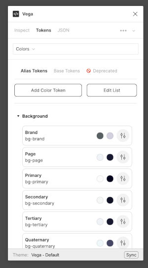
How to see all available Color Tokens
- Launch the Vega Plugin if it isn’t already open and select the Tokens Tab
- In the Tokens tab, select Colors from the dropdown menu.
- Here you can see a list of Alias Tokens that you would use for styling your layouts.
- The ability to Add or Edit tokens is limited to Vega maintainers at this point, so you may not see those options depending on your role.
- Base Tokens show the spectrum of colors that Alias Tokens are mapped to behind-the-scenes for each mode (light/dark)
- Deprecated Tokens list the old tokens that are not meant to be used anymore. They are only listed here to provide backwards compatibility for older components that link to those colors.
Typography
Typography tokens are categorized by how they appear in the hierarchy of a page. The decisions regarding font size and weight are included in the token so that, as the designer, you can simply choose the appropriate typography token based on the message your layout needs to provide to your target audience.
Dynamic Sizing
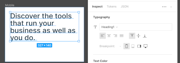
Typography settings define how type styles adjust to the size of the page, dependent on the defined breakpoint. For instance, Heading 1 applied to a text layer will have a different size depending on the size of the device being used. Desktop (XL) sizing would be set with a size/height of 60/110, however if the same heading were to appear on a mobile device (S) would be given the size/height of 34/104.
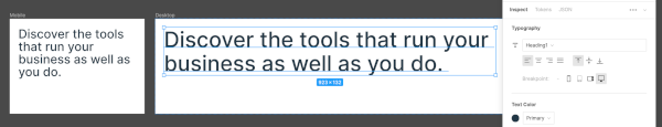
This helps maintain consistency in how we adapt our font styles across breakpoints, and frees you from having to constantly look up the appropriate styles to use when adapting a layout for different breakpoints. The plugin provides an easy switch to choose the right breakpoint for your text layers.
In the future we will also automate switching text styles for your layouts based on the size of parent container frames, which will make it even easier to generate mockups for different breakpoints.
Headings
Heading tokens follow a pattern similar to their HTML counterparts, with Heading 1 being the largest and Heading 6 being the smallest size heading. When choosing a Heading token for your layout, consider how the content fits into the overall hierarchy of the page. The system will handle the rest, including setting the correct font size, line height, character spacing, and text decoration.
Body
Body tokens are based on how long or short the text is expected to be. Short paragraphs with three to four lines should be styled using tokens with shorter line heights so they can appear as a single concise unit while still being comfortable to read. Long paragraphs should be styled using tokens with taller line heights to improve legibility and for comfortable reading.
Labels
Label tokens are used for styling text within components. Button labels, field labels, and navigation labels are all examples of text layers styled with Label tokens.
Captions
Caption tokens are primarily used to style text that provides additional context to a component. One example might be helper text explaining that a field in a form is required. Caption tokens may also be used for styling low priority content such as disclaimers or legal content at the bottom of a page.
How to Apply Typography Tokens
- Launch the Vega Plugin if it isn’t already open and select the Inspect Tab
- Select the text layers on the canvas that you wish to style.
- Choose the appropriate token from the Typography dropdown menu
- The breakpoint will default to Mobile, so choose the appropriate breakpoint if you’re not currently designing for Mobile
How to see all available Typography Tokens
- Launch the Vega Plugin if it isn’t already open and select the Tokens Tab
- In the Tokens section, select Typography from the dropdown menu.
- Here you can see a list of Alias Tokens that can be used for styling your text layers.
- The ability to Add or Edit tokens is limited to Vega maintainers at this point, so you may not see those options depending on your role.
- Base Tokens show a list of internal tokens that include the font family, size, and weight that Alias Tokens are mapped to behind-the-scenes for each breakpoint.
- Deprecated Tokens list the old tokens that are not meant to be used anymore. They are only listed here to provide backwards compatibility for older text layers that link to those tokens.

Borders
Border tokens encapsulate design decisions around border thickness, border style (solid or dashed), and border color (mapped to a Border Color Token). The color token internally maps to different colors based on the mode (light or dark).
Border tokens are named based on the function they provide, rather than any specific styling information. The system does not include many border tokens as of now but we are open to adding more as required.
How to see all available Border Tokens
- Launch the Vega Plugin if it isn’t already open and select the Tokens Tab
- In the Tokens section, select Borders from the dropdown menu.
- Here you can see a list of Alias Tokens that you would use for styling your components.
- The ability to Add or Edit tokens is limited to Vega maintainers at this point, so you may not see those options depending on your role.
- Base Tokens show a list of internal tokens that include border thickness and border style that Alias Tokens are mapped to behind-the-scenes.
- Deprecated Tokens list the old tokens that are not meant to be used anymore. They are only listed here to provide backwards compatibility for older components that link to those tokens.

Spacing
Spacing tokens are used to identify any of the following:
- Space between elements
- Padding within elements and components
- Fixed sizes of components (width and height)
Spacing tokens help us in applying uniform padding and spacing to all our components. In some cases they help us define the fixed dimension of an element (an icon, for example).
These tokens are named based on their size. For example, the spacing token we name as xs maps to 8px. This naming convention helps us immediately identify the value of a token without having to look it up, and it keeps the system flexible by allowing us to add more tokens in the future, if required. (In the plugin, we show the pixel size to make it easier to understand).
Note: In Figma, spacing tokens can only be applied via the Vega Plugin. It’s important to understand that they can only be applied to frames with auto-layout enabled, since the padding and space-between attributes of frames are only available via auto-layout.
How to apply Spacing Tokens
- Launch the Vega Plugin if it isn’t already open and select the Inspect Tab
- Select a Frame containing one or more child layers.
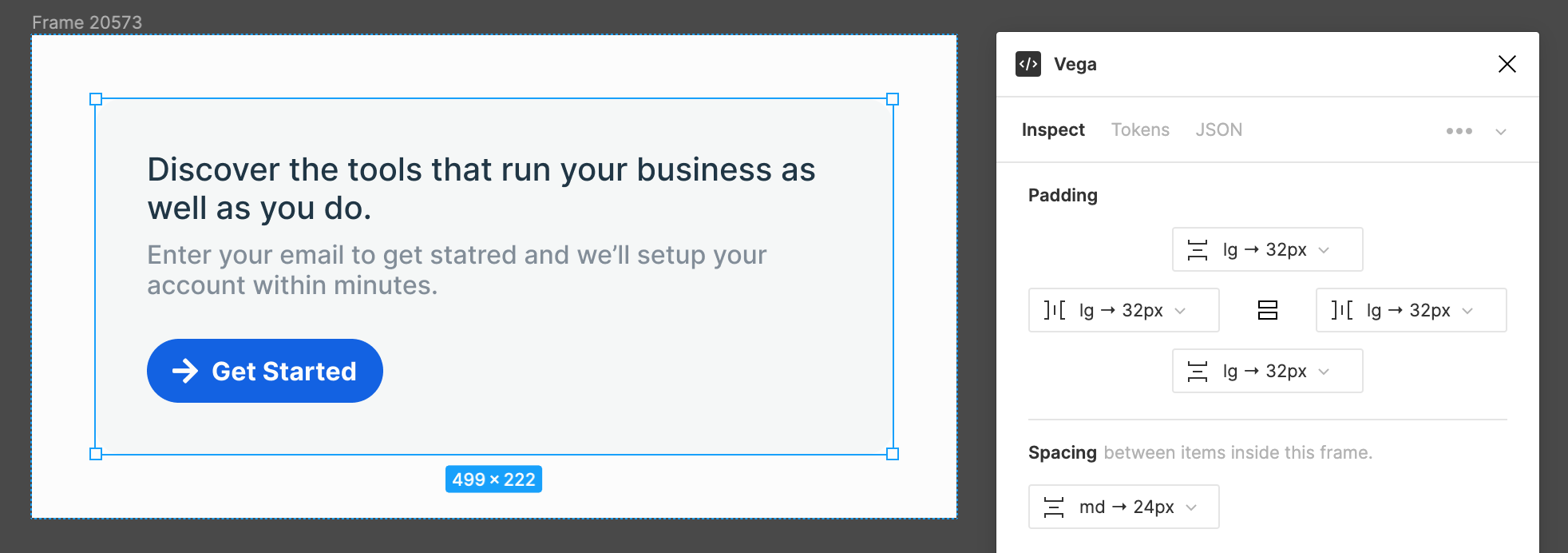
- Choose the appropriate spacing tokens to apply as Padding on the top, bottom, left, or right. The dropdown menu will only show you values.
Hint: Holding down
Alt(on Windows) orOption(on a Mac) when selecting a token will apply the same token to the opposite side. Holding downControl(Windows) orCommand(Mac) instead will immediately apply the selected token to all sides.
- For Frames containing more than one child layer, you will also see the option to apply a spacing token as the Space Betwee the child layers.
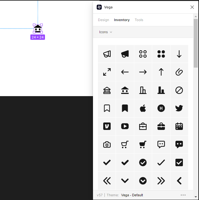
Icons
Icons in Vega are entered by the following method.
In the plugin, go to the Inventory tab, and select Icons from the dropdown. Here you will see a list of all icons that are already available in Vega.
To use an icon, select it and drag and drop it onto your canvas.
This will automatically set the glyph to the token value of the icon.
Optionally, you may use this alternate method:
Using your keyboard, select Shift-i and then search for “icon”
Drag the placeholder icon (as shown above) to where you wish it to appear on your canvas. This will create a placeholder icon, with a default size of 24 x 24.

Select the “Glyph” placeholder.
This will show a library of existing icons in Vega. Choose the icon you wish to use:
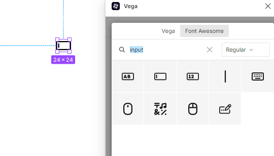
Using the Font Awesome library
Once you have an icon in place, select your icon, go to the design tab, and click on the glyph value and choose the Font Awesome tab.
You can then search for a keyword within Font Awesome, and you will be able to find a selection of icons which match. Select it to choose it.
With Font Awesome, there are many built-in variants for each icon, so you can search by style as well:
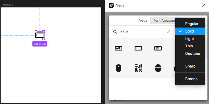
You may also change the style of an existing Font Awesome icon in the plugin, by selecting it and changing the style.
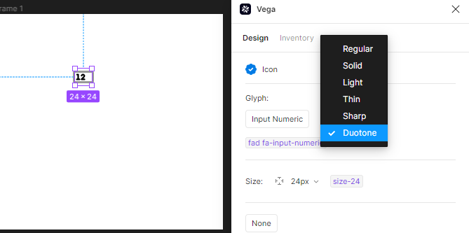
Create Your Own Icons
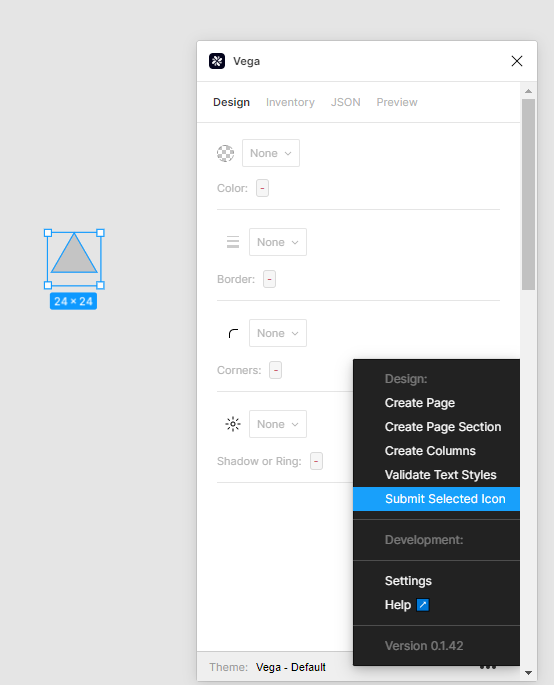
You may also create and submit your own icons. To be able to do this, you must create a frame and set it to 24 x 24.
Create your icon, select it, and choose the three dots on the lower right hand corner of the plugin, and choose Submit Selected Icon.
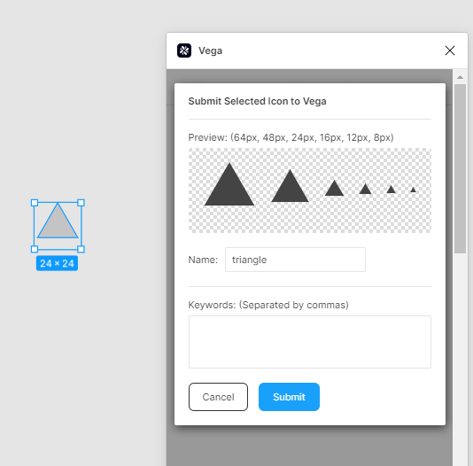
You will then see a preview of your new icon. Give it a name, and then click Submit.
Shadows
Shadows tokens include a limited number of options, and are named for their function, not their look. The function of shadows within Vega is mainly for styling buttons or input fields to indicate that actions can or should be taken. There are currently 4 shadow options available in Vega: button-focus, darkmode-button-focus, input-text-focus, and input-text-focus-warning
Corners
Using the Vega plugin, you can set a corner radius for the purpose of creating rounding effects. Tokens are set by size specifications, but also provide information about the number of pixels applied. The tokens enforce a 2px ratio between different rounding styles.

Breakpoints
Breakpoints can be applied to Typography tokens to adjust for different screen sizes.
To do so, select the different size device from the breakpoints in the plugin:
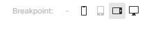
You will see your selected layer resize or adjust depending on the size you have chosen.
In the context of typography tokens, this will result in a change of the font size and weight of the selected text layers when a new breakpoint is applied to that layer.
If you select a different breakpoint, you will be applying a different variant of the typography token. This is because text needs to be styled differently for different breakpoints.
Components
Once you have constructed an elaborate design (of varying degrees) designed to serve a specific function within your application, you can create a component. Components are elements that can be reused across different designs, and can help maintain a level of consistency within Vega.
If you have created a component and would like to submit it for consideration as a part of Vega, [please follow the instructions on contributing to Vega. You may also use these pages to submit additions, edits, or report bugs.